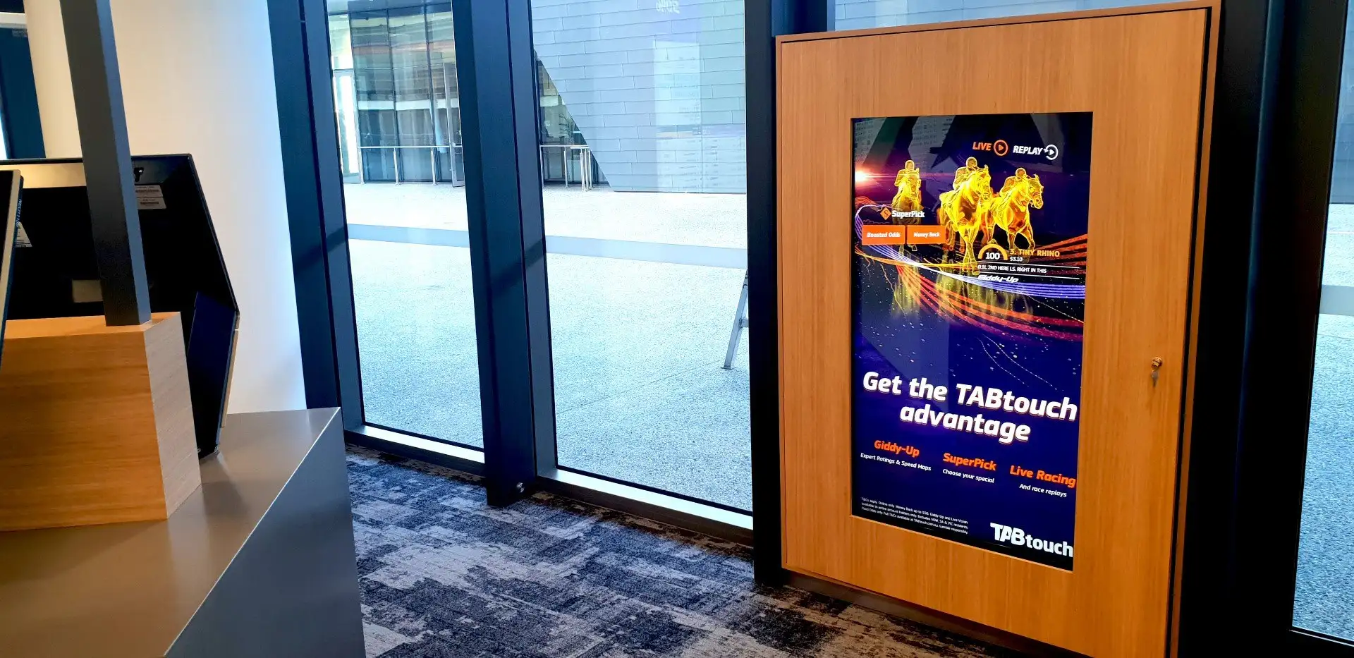
Three per cent. That is roughly how much of the light falling on a commercial display’s front surface comes back out at the viewer, and it is the number that decides whether anyone reads your signage. Not the resolution. Not the panel’s contrast ratio, which was measured in a blacked-out laboratory by someone who has never stood in a Perth foyer at two in the afternoon. Three per cent of whatever light is in the room, bounced off the glass in front of the pixels, sitting on top of the image like a sheet of tracing paper.
Here is the position, and it is worth stating before the arithmetic. Brightness is the last specification to decide, not the first — and in most Perth buildings, moving the screen is worth more than any brightness you can buy. The industry does not say this, because the industry’s answer to glare is a higher-nit panel, and a higher-nit panel has a part number, a margin and a lead time. Nobody can invoice you for turning a screen ninety degrees. That asymmetry has quietly shaped how commercial digital signage in Perth gets specified for a decade, and it is why so many foyers contain an expensive screen that nobody looks at.
The arithmetic nobody does before the screen is ordered
A display’s job is to be brighter than its own reflection. That is the whole contest.
Every panel has a front surface, and every front surface returns some fraction of the light that lands on it. Bare glass returns about four per cent at each air-to-glass boundary — that is Fresnel reflection, a property of the material, not a design choice. Anti-glare coatings scatter that return rather than mirroring it, which is why a matte panel shows you a soft grey wash instead of a sharp image of the window. Independent display measurement puts total reflections on a typical panel in the low single-digit percentages. Three per cent is a fair working figure.
The luminance that reflection adds is close enough to:
reflected brightness (cd/m²) ≈ lux on the screen’s face × reflectance ÷ π
That number gets added to the panel’s blacks and its whites. Blacks are where the damage is done, because a black pixel emits nothing, so the reflection is all there is. The ratio between the two is what your eye calls contrast, and it has very little to do with the figure on the brochure.
A worked example you can check in your own foyer
Take an ordinary commercial panel rated at 500 nits — the middle of the 350 to 700 band that indoor corporate screens live in.
Hung on an internal wall, 400 lux of office lighting on its face. Reflection adds 400 × 0.03 ÷ π ≈ 3.8 cd/m². Whites land around 504, blacks around 3.8. On-screen contrast: roughly 130:1. Perfectly readable. Nobody complains.
The same panel, two metres inside north-facing glass on a clear morning, 20,000 lux on its face. Reflection adds 20,000 × 0.03 ÷ π ≈ 191 cd/m². Whites go to 691, blacks go to 191. On-screen contrast: roughly 3.6:1. The spec sheet still says 4000:1. The screen is now a lightly tinted mirror with a suggestion of a logo in it.
Now spend the money. Swap in a window-facing high-brightness panel — LG’s current window-facing line is rated at 4,000 nits typical, and 2,500-nit models are common — and at 2,500 nits in that same 20,000 lux you get about 14:1. Four to five times better, and still a tenth of what the cheap panel managed on the internal wall.
Or turn the screen to face into the building instead of across the glazing, where the light on its face falls to something like 1,000 lux. The original 500-nit panel now returns about 9.5 cd/m² of reflection and delivers roughly 54:1 — comfortably better than the expensive panel in the bad position, at no hardware cost at all.
Those are order-of-magnitude figures, and they deserve their caveats: real panels are not perfect diffusers, reflectance varies with coating and viewing angle, and a phone light meter is not a calibrated instrument. None of that changes the shape of the result. The gap between 3.6:1 and 54:1 is not a rounding error, and no brightness upgrade available for sale closes it.
What digital displays in Perth are actually competing with
The reason this matters more here than in Hobart is not patriotism, it is light. Perth averages roughly 8.8 hours of sunshine a day — about 3,200 hours a year, the most of any Australian capital. That sun arrives at low angles for most of autumn and winter, which is exactly when it reaches furthest inside a building.
For scale: direct sunlight is upwards of 100,000 lux. Full daylight out of direct sun runs 10,000 to 25,000. A dull overcast day is around 1,000. Office lighting is 320 to 500. The step from an internal corridor to a glazed foyer is not a small increase in difficulty — it is a factor of fifty, and it happens over about six metres of floor.
Run the first calculation on direct sun and the picture gets blunter still: 100,000 lux on a panel’s face adds roughly 955 cd/m² of reflection. That is more than most indoor screens emit at full white, which is the formal way of saying that a 700-nit panel in a sunbeam is off, regardless of whether it is on.
Two secondary effects make Perth foyers worse than their lux readings suggest. Light-coloured pavers, white render and polished concrete forecourts throw a great deal of daylight back up at the building, so screens set back from the glass still catch it. And the brightest object behind the viewer lands on the panel as a specular highlight — a west-facing window behind the reception desk will put a rectangle of sky across the middle of the screen that no amount of backlight will burn through.
Geometry is free. Nits are a line item.
None of the above is an argument against high-brightness displays. They are real products that solve a real problem, and when the problem is genuinely unmovable they are the only honest answer. A shopfront screen facing a street cannot be rotated; the street is where the readers are. That is the case window-facing panels were built for, and it is the case where paying for 2,500 to 4,000 nits, active cooling and a sealed glass-line mounting is simply the cost of the job.
What the industry does badly is apply that answer indoors, where the problem is almost always movable and almost always free to move — provided somebody raises it while the floor plan is still a drawing.
The moves are unglamorous and they all cost nothing at design stage:
- Rotate the screen off the glazing axis. A panel facing along a glass wall sees a fraction of the light that a panel facing across it does.
- Pick the dark wall. Signage on a white wall is competing with its own backdrop; the same screen on a dark feature wall reads from twice the distance.
- Delete the downlight directly above it. A single poorly placed fitting can put more light on a screen face than the windows do, and it is the cheapest thing in the room to move.
- Recess it into the joinery. A screen set back behind a timber reveal gets a shade from its own surround — the approach we took for the signage wall at the State Timber Museum at Manjimup, where the cabinetry was built by other trades before we arrived and the screens had to line up with it exactly.
- Set it back from the glass line. Illuminance falls away sharply with distance from an aperture. Three extra metres into the building is often worth more than 2,000 nits.
Sightlines and light have to be solved together, not in sequence. When we put six signage screens across the gym floor at Anytime Fitness, the stated constraint was that no member should be looking at the back of a screen from any corner of the floor. Sightline and light have to be satisfied by the same position, and together they narrow a room down fast. They are a design conversation, not a procurement one, and they have to happen before the joinery drawings are signed.
The Noon Walk
Seven steps. They take about twenty minutes, they need a phone and a tape, and they belong in the design phase — not in the handover meeting where somebody first notices that the screen has disappeared.
- Go at the worst hour, not a convenient one. Between 11am and 3pm. If the glazing faces north, go in late autumn or winter, when the sun is low enough to reach deep into the building.
- Stand where the reader stands. The person you are designing for is walking past at three metres, not standing square at one. Reflections are directional — what you see at the screen is not what they see from the lift lobby.
- Measure the light on the screen’s face, not the room. Hold a phone light meter flat against the proposed screen position, sensor pointing out into the space. Record the lux. Phone meters are rough, but you are distinguishing 400 from 20,000, not 400 from 450.
- Look behind the viewer. Photograph what is behind their shoulder. The brightest thing there will arrive on the panel as a highlight.
- Do the division. Lux × 0.03 ÷ 3.14 gives the black level the screen has to beat. Put it next to the brightness of the panel you were about to specify, and you have the real contrast ratio.
- Write the number on the drawing. Not “high brightness”. The measured lux, the date, the hour. It is the only part of this that survives a change of project manager.
- Spend ten minutes finding a wall with a smaller number. This is the step everyone skips, and it is the one that saves the money. If a position twelve metres away reads 1,200 lux instead of 18,000, the argument about panel brightness is over.
If the best available position still reads above about 5,000 lux, you have a genuine high-brightness job and you should buy one properly. If it reads under 1,000, a standard commercial panel will do, and the difference belongs in content and in the software that drives it.
Why outdoor digital signage in Perth is a different purchase
Everything above assumes you can move the screen. Outdoor and shopfront signage assumes you cannot, and that changes the product category rather than the specification.
Here you are buying brightness, weather sealing and heat management as a package, because a sealed enclosure in a 40-degree Perth summer with a 4,000-nit backlight inside it is a thermal problem before it is a display problem. And beyond roughly 75 inches, high-brightness LCD stops being the sensible answer and direct-view LED screens take over — a different engineering discipline with a different failure mode, where the number that matters is pixel pitch against viewing distance rather than nits against lux.
The Noon Walk still earns its keep outdoors. It just answers a narrower question: not where should this go, but how bright does it have to be, and what will that cost to cool.
The case for buying the bright panel anyway
Three honest arguments cut the other way, and we make all of them on site.
The first is that sometimes the architecture wins. The only available wall is the glass wall, the tenancy is fixed, the heritage listing is not negotiable, or the brand genuinely wants the screen read from the footpath. Geometry is free only while it is still a drawing. Once the joinery is installed and the glazing is in, buying nits may be the only lever left, and refusing to pull it out of principle leaves the client with an unreadable screen.
The second is longevity. A 2,500-nit panel driven at forty per cent output runs cooler and softer than a 700-nit panel pinned at maximum all day, and backlights generally last longer for it. If the position is marginal rather than hopeless, the brighter panel bought as headroom is a defensible purchase.
The third is that anti-glare coatings are not free either. Diffusing the reflection is better than mirroring it, but haze softens the image and slightly lifts black level in its own right. A low-haze matte finish looks sharper and reflects more; a heavy matte finish kills reflections and looks slightly veiled. There is no coating that wins both, which is another way of saying the surface cannot rescue a bad position.
What none of those arguments licenses is the common sequence: choose the wall for its sightline, discover the glare at commissioning, and then buy brightness as a remedy. Bought late, nits are a repair. Bought early, against a measured number, they are a specification.
Three things to fix before the joinery is built
Signage fails slowly and quietly. A screen that cannot be read does not raise a ticket; people simply stop looking at it, and eighteen months later someone asks what the screens are for. By then the position is set in cabinetry and the only remaining options are expensive.
So, in order, and all of them before trades are on site:
- Take a lux reading at every proposed screen position, at the worst hour, and put it on the drawing. It costs twenty minutes and it is the only measurement in this process that is genuinely hard to argue with.
- Let the light move the screen, not the other way round. Treat panel brightness as the output of the placement decision rather than the input. If a position forces a high-brightness panel, that should be a conscious trade, priced and signed off.
- Decide who owns the content and the fleet before you decide the hardware. A perfectly placed screen running a dead slide is worse than no screen. That is the software question we have argued at length elsewhere — whether the platform is Fusion Signage, Tripleplay or something else, the publishing workflow and the monitoring under Focus Care decide whether the fleet is still working in year three.
The screen nobody reads is rarely the cheap one. It is usually the one whose wall was chosen for how it looked in the render. Get the light measured first, and most of the brightness argument disappears — which is exactly how digital signage design and installation in Perth ought to work.